Academic, 2021
Propoganda Maps
Individual Projects for SCI 6322 Mapping: Geographic Representation and Speculation
Blender, Python and Adobe Illustrator
Advisor : Eric Robsky Huntley
Introduction
In a world increasingly flooded with data and information, the challenge of making sense of our surroundings has never been greater. Amidst this deluge, maps serve as beacons of clarity, guiding our understanding of complex phenomena. However, as our world evolves, so too must our methods of representation. The projects presented here venture beyond traditional cartography, challenging preconceptions and exploring innovative ways of visualizing information. From the whimsical to the sobering, these endeavors illustrate how maps can transcend their conventional roles, not just charting the physical, but also mapping the invisible landscapes of human belief and disease spread.
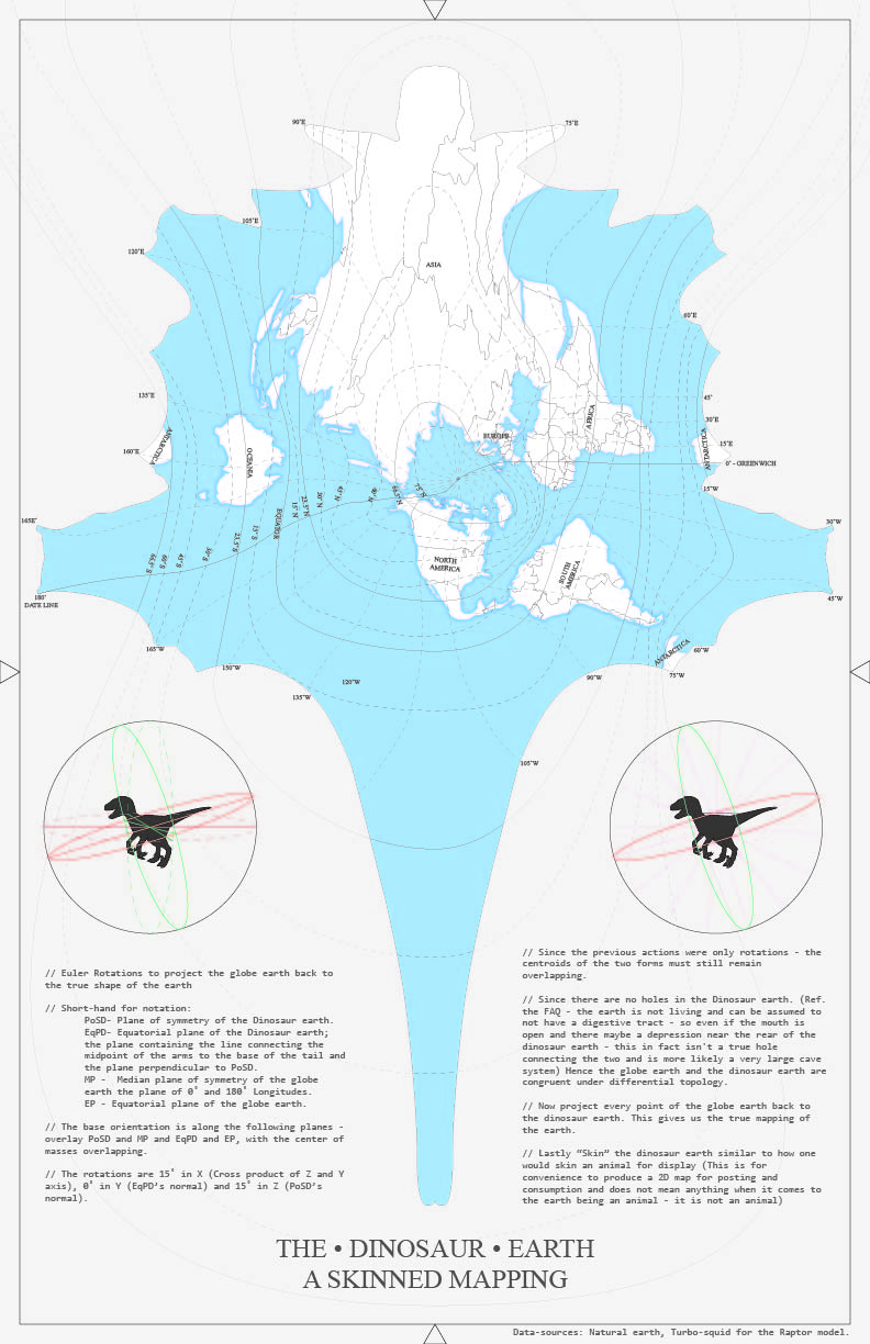
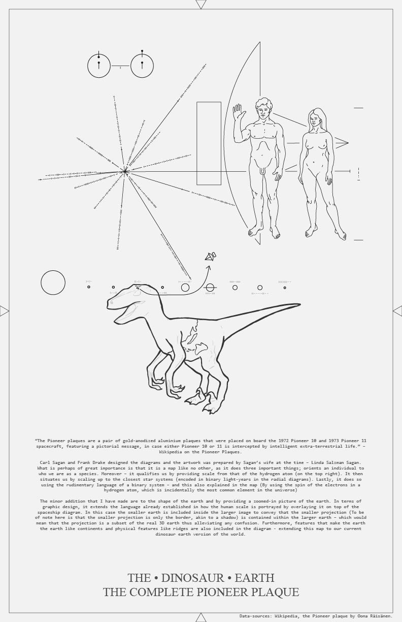
The Dinosaur Earth
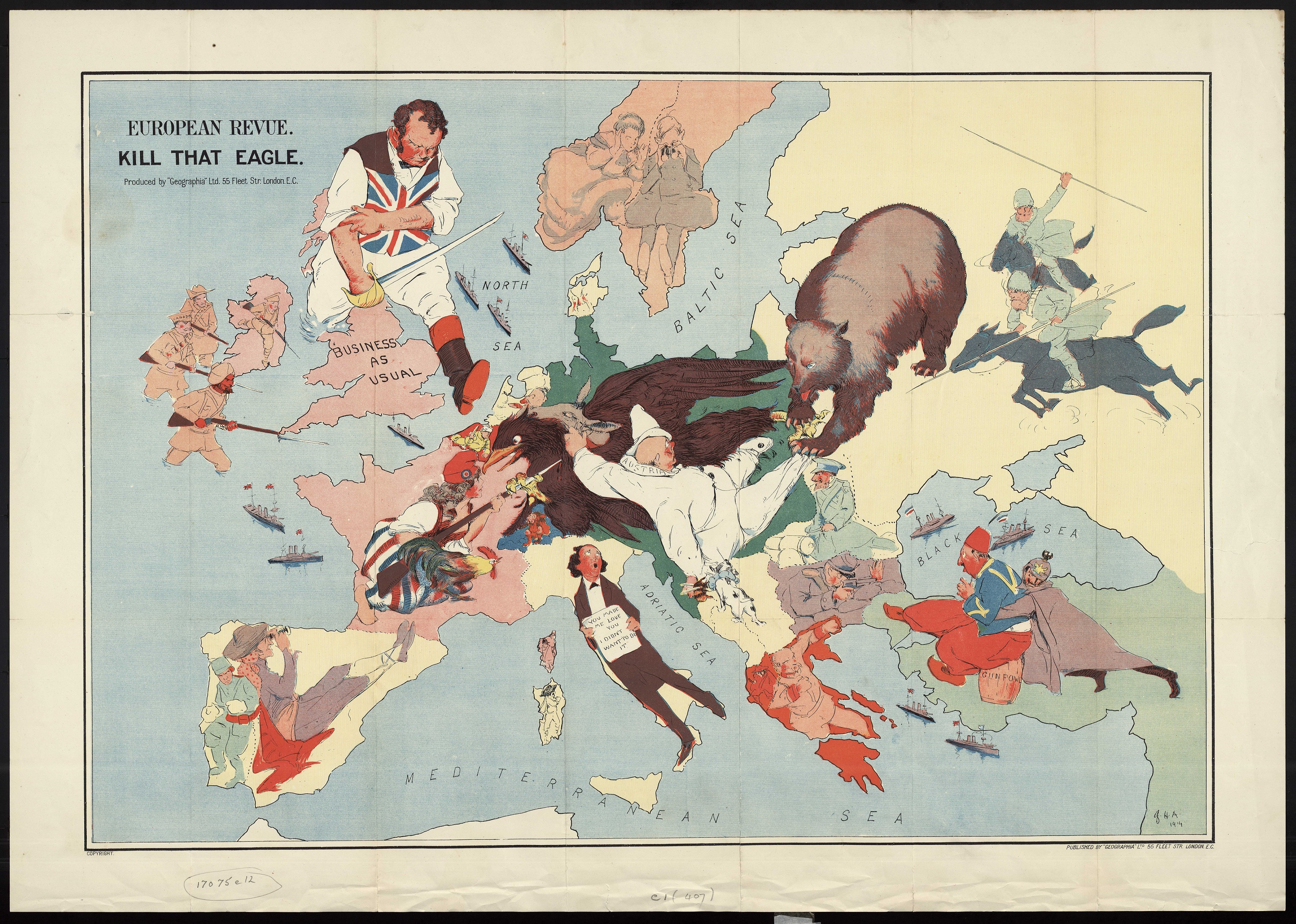
In an era where misinformation spreads faster than truth, addressing deeply ingrained misconceptions requires more than just presenting facts. The Dinosaur Earth Project embodies this challenge, tackling the flat Earth conspiracy with an inventive approach. By proposing a map where the Earth is depicted as dinosaur-shaped, this project aims to engage believers in flat Earth theory on their terms. The hope is to encourage critical thinking and discussion, leading them to question the implausibility of their own model. This method reflects a broader strategy: to counter misinformation, we must be willing to engage imaginatively, presenting ideas that provoke thought and reconsideration.
Visualizing COVID-19
The second project takes on a more somber tone, addressing the global crisis of the COVID-19 pandemic. Traditional maps, with their planar surfaces and static representations, fall short in conveying the dynamic and multifaceted nature of a viral outbreak. Drawing inspiration from John Hessler's work on thematic cartography, this endeavor models the Earth based on population densities, transforming it into a network of interconnected nodes. This network, represented as a crumpled ball of cloth, visually communicates the severity of the pandemic and the interconnectedness of our global community. By illustrating how the virus spreads and affects densely populated areas differently, this map aims to make the abstract tangible, fostering a deeper understanding of the pandemic's impact.
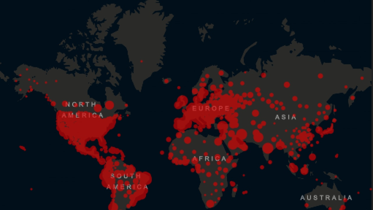
A traditional map showing COVID-19 hotspots
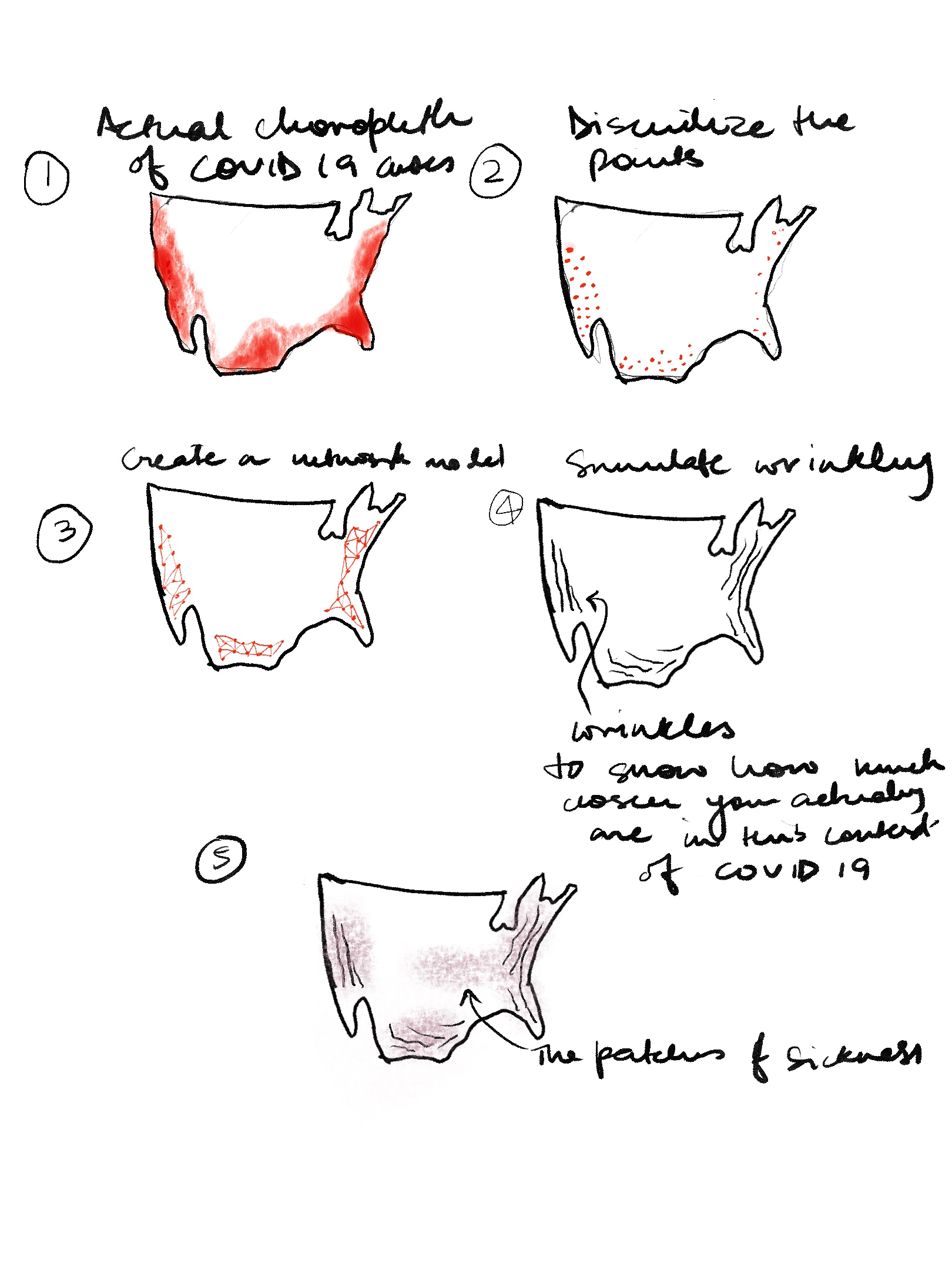
The process of constructing the alternate globe
John Hessler's work on thematic cartography
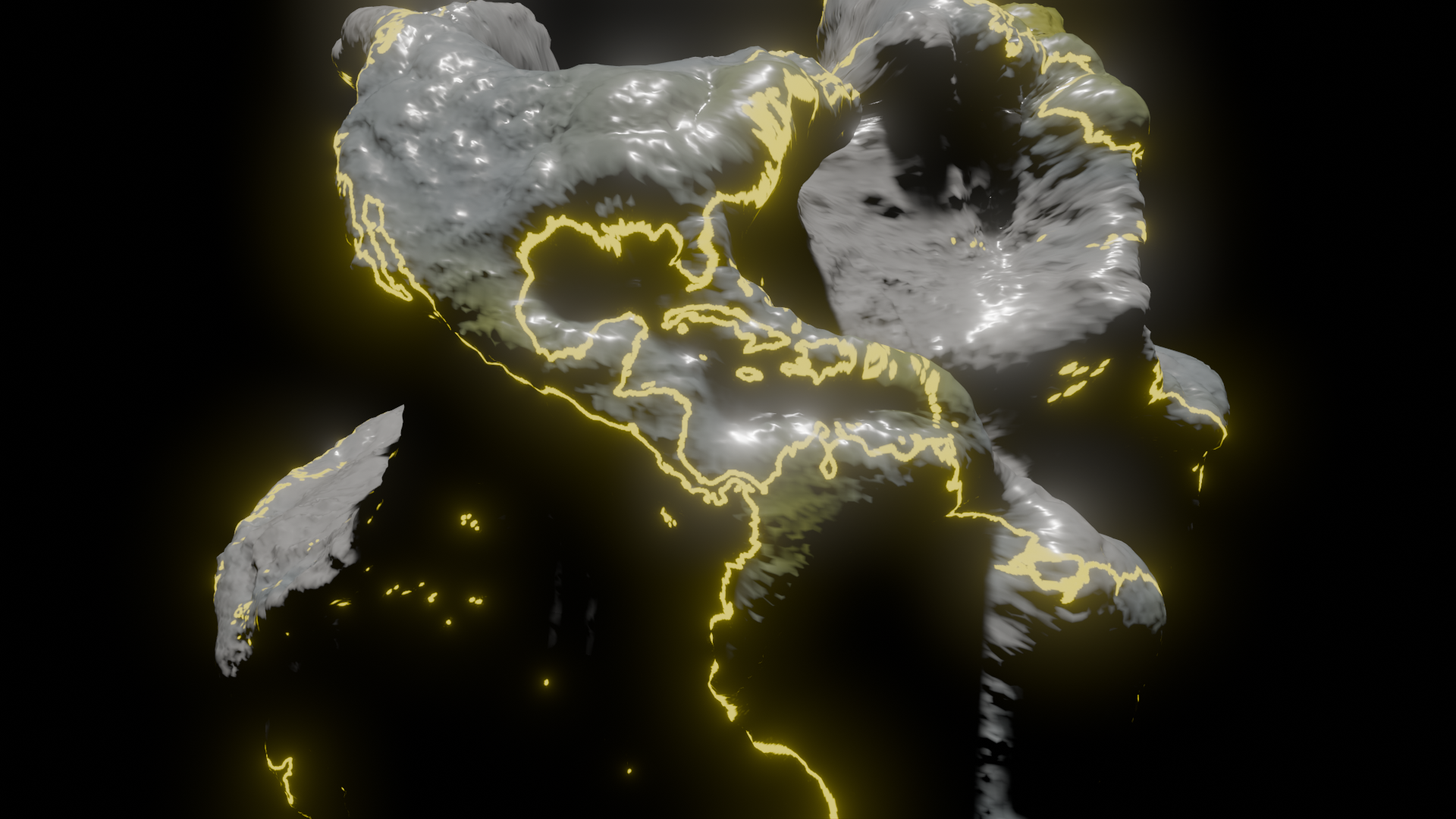
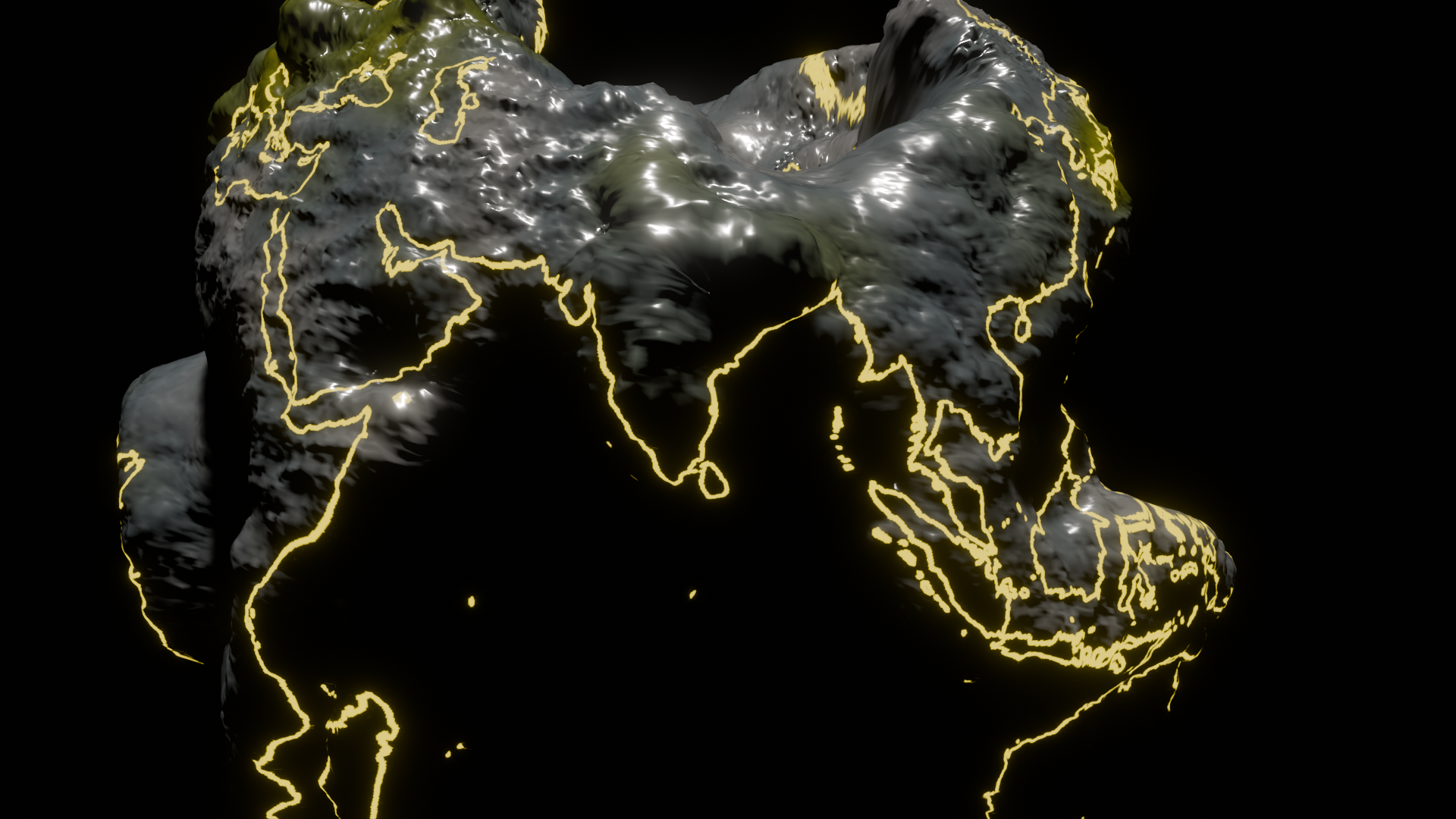
Screenshots from the visualisation
Check out the globe!Conclusion
Together, these projects underscore the potential of maps as powerful tools for altering perception and enhancing understanding. By stepping beyond traditional boundaries, they invite us to reimagine what maps can be and what they can accomplish. Whether challenging misconceptions about the Earth's shape or visualizing the spread of a global pandemic, these maps do more than represent physical realities—they also chart the terrains of belief, fear, and hope. In doing so, they remind us that to change the way we perceive the world, we must first change the way we represent it. Through creative cartography, we can illuminate unseen dimensions, guiding society towards greater awareness and empathy in navigating the challenges of our time.